BagNews Archives About Staff BagNews is a progressive site dedicated to visual politics and the analysis of news images.
Monday, February 13, 2012

Twitter

@bagnewsnotes »
Advertisement


November 15, 2008

Your Turn: The New Yorker’s 44 Cover

Staake Reflection TNY.jpg

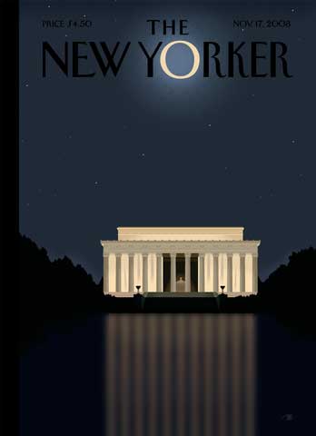
With the election not even two weeks old, president-elect Obama is being elevated to lofty heights through artistic inspiration. In light of the “Obamanomenon,” I’m curious about this new cover of The New Yorker.

Elegant in its peacefulness, its spirituality (the “O” like the new moon) and Obama’s power duet with Lincoln, I do have some concerns about deification. Is Obama coming off here as a celestial body or, thinking halo, as some kind of angel?

How do you read this graceful work?

(image: “Reflection” by Bob Staake. New Yorker cover. November 17, 2008)

  • http://www.fightingliberals.com the littlest gator

    I love this cover. I don’t find it deifying… actually the opposite. Newness yet. but quiet, strong, peaceful.
    Not leader as god.
    plus with the fall, lots of other thoughts. harvest moon. coming winter. distant. but known.
    these are truly just emotional impressions. But I am not really getting the god/celebrity thing here.
    *tlg

  • lytom

    For many it is still a “honeymoon!”

  • JayDenver

    re: lytom @ 06:48 My thoughts exactly.

  • Cyranetta

    One curious effect is the reflection in the pool makes it look like the Lincoln memorial is glacier-like, with the greater portion “below the surface”.
    Although the memorial is bulkier, the “O” is marginally brighter, but it looks fragile, and when you consider that the moon is reflected light, that doesn’t give the “O” much of its own strength.
    So I see the cover as elegant, tentatively hopeful, but cautionary.

  • rmforsyth

    The rising moon of Obama over Lincoln’s Memorial depicts to all American the beginning of a new great era for America.
    The pasat enslavements and struggles, the horror of the shredding of the Constitution behind us and hope for a new beginning. This is not the diefication of Obama but the diefication of the United States of America.

  • http://www.typepad.com/t/trackback/1452/35802162 Kimberly

    If you look at the reflection of the Lincoln monument in the Reflecting Pool, you can see a visual echo of the World Trade Center (as well as the Towers of Light memorial lit at every 9/11 anniversary). This is very subtle, but I think it’s unmistakable. The message: In the wake of the terror and turbulence of 9/11 and the wars waged in its wake, Obama will bring peace…and he will return US to our true mission, seeking a more perfect union.
    I share your concern with the hints of deification. This one, we could almost call “Silent Night.”

  • shane

    To me, the photo suggests a moment of peacefulness, the resolution – finally – of a harrowing and endless election cycle in which it felt like the soul of the country was at stake. I agree that it projects hopefulness, and also the long-yearned-for end to an eight-year tragedy. It draws me in and asks me to simply stop…..and reflect and exult in the fact that Yes, We Did. It’s beautiful, heartening, stunning.

  • http://www.typepad.com/t/trackback/1452/35802162 Kimberly

    See the famous 9/11 “falling man” photo published in Esquire at: http://www.esquire.com/cm/esquire/images/fallingman-lg.jpg (warnings to anyone who may find it upsetting).
    This image, where the tower’s striped appearance is very prominent, is being quoted in the New Yorker cover, in the quiet, dark waters of the Reflecting Pool.

  • Johanna

    It’s nice to hear you have concerns about deification. Comparisons to Lincoln are quite presumptuous, too.

  • Kimberly

    Hope. I think of hope when I see this. And optimism. I read his book “The Audacity of Hope” and Obama’s philosophy on leading is the balm for the jangled nerves I’ve had since 2000. Whether his first term as President is a remarkable success or bumbling attempt to right the wrongs of the Bush debacle, I feel at peace at least knowing that THIS time we’ve chosen a President who has the country’s best interests in his heart and mind, rather than the best interests of him, his friends, and certain powerful brands.
    I hope.
    This illustration adds the perfect visual to that hope.

  • thebewilderness

    It is a beautiful picture. My first though was of a pictue I have seen or thought I had seen of the Taj Mahal.
    Then, to me, it becomes all about tombs.
    So it is beautiful and creepy.

  • Asta

    This reminds me of the artwork of the Japanese block print artist Kawase Hasui. When I view this image, I feel serenity, and a kind of calm I haven’t felt in the last 8 years. The Bush Years have been times of chaos, whether orchestrated or accidental, and now we have a chance to experience a time of peace and healing.
    It’s our Moment of Zen.
    http://www.hanga.com/viewimage.cfm?ID=1111
    http://www.hanga.com/viewimage.cfm?ID=1228
    http://www.hanga.com/viewimage.cfm?ID=3302

  • jattie

    Took it out of mailbox and stopped in my tracks. Found it stunning in its quiet grace and multiple subtexts. Immediately thought of the fact that February 2009 is the 200th anniversary of Lincoln’s birth and the memorial is scheduled for rededication. That Obama will be heading that event feels like a historical loop being completed. Obama’s own study of Lincoln and his ability to deploy Lincoln’s phrases to link contemporary audiences to the “unfinished work” of the past made the image enormously powerful to me.

  • Evan

    I find it interesting that nobody has commented upon the fact that the “O” is much more similar to the moon during a total lunar eclipse. Though i initially noticed it to be similar to a halo, i find that the eclipsed moon is far more evocative. This image does indeed show some similarity to wood block prints, and due to this one could take the moon to be a symbol of eclipsed femininity. Maybe a shout-out to the folks who would have liked to see Hillary take the nomination, or Palin take the vice presidency?
    However, the fact that this eclipse is taking place above the Lincoln Memorial does even more to enlighten the viewer about the reflection of this image on current political trends. Lincoln is most famous for signing the Emancipation Proclamation. This is not to say that he harbored the racist views that were prevalent in that time period, and was not completely abolitionist. He did, and he wasn’t. The eclipse and nighttime setting of this image indicates an end of idolization for such figures as Lincoln in the race rights movement as well as the rise of those like Obama who have overcome prejudice and racism by an altogether different means.

  • Asta

    Is it just me or does it seem that the Big Dipper is upside down over the Memorial?

  • http://www.highfibercontent.blogspot.com JulieZS

    This really reminds me of the artist, Erte’. The stylistic rendering of the memorial and the use of lighting in the image. A beautiful, peaceful cover for the magazine, full of hope, before the gritty reality of what is awaiting Obama when he takes office. Lincoln looks very far off, in the distance, something to be aspired to, and hopefully attained at some point in the future…

  • lizep

    The shining O above this peaceful, meditative stilllife represents Obama, of course: the Obama who completes the circle of slavery/emancipation/Jim Crow/partial rights/equal rights/the presidency. Another completed circle, lesser but still of interest, is Chicago’s Grant Park in its transformation from the angry, violence of 1968 to joyous, hopeful celebration this November 4th.

  • JayMagoo

    I’m not an art critic, so my reactions are strictly visceral reactions.
    I first saw it as a new moon rising, a dim, peaceful moon struggling to brighten a dark landscape. The new moon offers hope, pure, so-far untested hope, yet as a beginning, it is bringing some light and is asking for help for dark days ahead. Abraham Lincoln fought the Civil War for many reasons, the most compelling reason was slavery which was ripping our country apart. That issue still causes horrible violence and resentments. It is fitting that the new moon is gently, tentatively trying to illuminate the landscape at the Lincoln Memorial.

  • Emma G

    I am an art historian, and I think this is one of the most visually stunning covers of the New Yorker in the past few years. It is quietly elegant and evocative, summoning so many visual, symbolic and historical links: the new moon, the campaign’s “O” motif, Sept. 11th, Lincoln’s achievements, the role of the Memorial itself in American history and visual memory, “I have a dream” (we dream at night, sleeping in the darkness), and above all the wonderful stillness of the entire composition. Dare I say, “Good night moon”?
    “Good night stars, good night air. Good night noises everywhere.” The noise of the campaign has died down, let us sleep and dream in the quiet, as the “moon” watches over us; hope will come with the morning.

  • theWalrus

    I cancelled my New Yorker subscription after the “Fist-bump” cover so, personally, I don’t care what they put on their cover.

  • Gasho

    Total alignment!
    As if this joyous moment in American history is written in the stars!!
    When I first saw the cover and realized the moon was an O for Obama, I was struck by the simplicity and power of the piece. Somehow, this captures the moment in our political lives. I got that sensation in my head and face that proceeds tears… and a determined smile of pride and hope.

  • Asta

    Upon revisitation:
    It’s a beautiful illustration. Sometimes maybe we should just appreciate the view, drink it in, and stop trying to split the white light. (Something I read in Lord of the Rings.)
    Just a thought.

  • Joe R

    My interpretation of the cover is skewed, because I live in DC. This peaceful vision of the Lincoln Memorial by moonlight is something I’ve enjoyed many times in real life (the memorial is too crowded to enjoy during the day, the locals mostly visit at night). Immediately, what comes to mind when I see this image of the LM is the *Words* written inside: the text of the Gettysburg address and Lincoln’s post-Civil War speech on race. They line the interior walls of the memorial, and they foreshadow a moment in our nation’s progress much like the one we are in… Kinda gives me chills. I think it’s brilliant.

  • nhcountryboyz

    When I saw this I thought the light illuminating the columns and casting the reflection on the water must arise from the INSIDE—sure, it’s a stylized Lincoln Memorial but did anyone else see it that way???

  • allosmaniatis

    Cover intimates the peaceful summation of Lincoln’s work and significance for American life and history.

  • Porlock Junior

    You want deification? I’ve got one stuck pixel on my laptop, always on at top white brightness. Move the window arount a bit and voila! — The Star stands right above the Manger, I mean Monument.
    Apart from which, it is a superb image. Scares me a little.

  • http://www.newyorker.com/reporting/2008/11/17/081117fa_fact_packer yesterdaygone

    How do you read this graceful work?
    idiotic.
    while other magazines commemorative issue celebrating barack’s victory, featuring his visage, sold out, this one remained on the shelves collecting dust.

  • Kat

    To me this cover evokes a sense of peace, a renewed pride in American institutions. I don’t see deification, but after the horrid “fist bump” cover, they could stand to do some kissing up.

  • http://authenticthreads.org/blog Braidwood

    First impressions:
    That cover makes me want to cry. Reminds me of the 1940’s for some reason. IT’s peaceful but still active and anticipatory, like something exciting is going to happen. Like a scene in a modern movie set in the 1940’s- people are wearing old dresses, there is a party, from a distance you can just here the sounds of laughter and music. This is one of those movies with a happy ending.