Notes
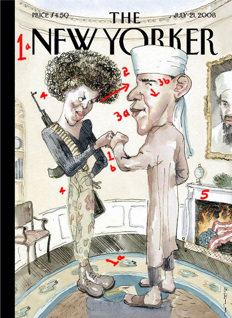
The "What" Of What's Wrong With The Barack Osama New Yorker Cover
The contribution Errol Morris made to visual politics earlier this summer, in explaining his Abu Ghraib film, was to emphasize how much the elements of a highly controversial image tend to get missed or "looked past" in the strong emotional and ideological reactions to the overall picture.
With this illustration having the capacity to roil the nets for days, I'm sure you've already seen analysis as to why it's so bad.
(Some of that rationale includes: a.) Otherwise topflight, liberal-minded illustrator forgets that parody involves the employment of imagery to convey something opposite its literal meaning, b.) Otherwise mistake-averse magazine becomes caught in blind spot after big city liberals get bitter and "cling to rhetorical guns" to express feelings of being jilted by overly centrist nominee, and c). Right wing mouthpieces who have so-far avoided turning into complete bottom feeders have just been handed enough cover for at least a week. )
What you're probably not going to see much of elsewhere, on the other hand, is the actual "what" of what's wrong here. Here's my list:
1. Set in an Oval Office the revolutionaries have cleared of the desk (because revolutionaries don't do desks, so much as lairs), the self congratulations — especially at this early, pre-convention stage of the campaign — ascribes a massive sense of entitlement to the Obamas.
2. Minus the eye contact of the actual fist bump in St. Paul (and adding the arched eyebrows), Angela Davis Obama's expression is transformed from "I love you" to "You're SUCH an evil genius, baby … and no one ever caught on!"
3. Besides Barack's pursed lips — which have turned into code in the MSM for this arrogant (read: "uppity") black man — the most damning element in this illustration, by far, is Obama's eye. The furtiveness lends the perfect Machiavellian effect, and the fact it's directed our way suggests we should really know better what this guy is up to.
4. Of course, the gun, the ammo clip, the cammo pants and the crossed legs (like crossed fingers) suggest what an angry, war-like creature Michelle is.
5. It's not just that Old Glory is on fire ("thank Allah I can finally toss that damn pin!"), the crumpled flag at floor level is reminiscent of the flag good old Bill Ayers was stepping on.
In my "ObamaPhobia" presentation at Netroots Nation next Saturday, I aim to show how various campaign images in the traditional media echo more extreme right-wing hate imagery — conveying Obama as a man with a covert, anti-American agenda, or a deliberate and calculated mastermind, or a closet Muslim and Islamic Manchurian candidate. In hitting the trifecta here, many will argue this illustration is simply a satiric representation of the sophomoric attacks being tossed at Obama from far right field.
If that's all there was to it, though, than why do I sense Rove is chortling tonight?
The reason — besides the fact that the New Yorker demographic is a pretty narrow one — is that visually-based racial, religious and character-based framing does carry cognitive weight across a spectrum of higher- and lower-level reasoning, and, more than anything, it gains strength and veracity through repetition.
So, forget about "don't think of an elephant." Try not thinking about the guy's name in the turban-thing without not thinking about his brother's name in the portrait behind him.
—
(Update 2:37pm) : I've been fascinated absorbing the comments here and at the cross-post at Huffington. Reading this again, the one thing I don't think I adequately framed above is why the parody fails. It's not so much that parody needs to convey something opposite, but it does have to execute some form of emotional or intellectual or editorial transformation on the elements put forth.
Interestingly, a number of readers zeroed in on this, and even offered Mr. Blitt ways this might have been done.
Waterrat says:
Something's missing.
Possibly a group picture on the mantle of Hannity, Coulter, Limbaugh, Beck, Rove, Cheney, and Bush, all snickering with unfettered delight.
Choppedliver writes:
Since the artist meant to skewer not Obama but the media's emerging, misguided portrait of him, it seems the drawing is incomplete. What we see here should be the picture on Obama's TV screen, as he sits in an all-American home with his wife and daughters, eating apple pie.
And Ken Drum at Washington Monthly writes (thinking audacity had something to do with it):
If artist Barry Blitt had some real cojones, he would have drawn the same cover but shown it as a gigantic word bubble coming out of John McCain’s mouth — implying, you see, that this is how McCain wants the world to view Obama.
To give us an appreciation, or a sense of outrage, or even a poke at any truth this picture might contain (especially the rapidly growing, but less openly discussed meme of Obama as Machiavelli, as opposed to Osama II), the illustration has to take us outside or beyond the manifest content here, and then show it to us again through a different window — be that a different context or a different point of view.
As a more instinctual way of explaining the problem, warincontext points out (making me think about last night's last-minute Remnick HuffPo interview) that satire isn't satire if it has to be labeled as such.
(illustration: Barry Blitt. New Yorker cover. July 21, 2008)
Follow us on Instagram (@readingthepictures) and Twitter (@readingthepix), and subscribe to our newsletter.
Topic
A curated collection of pieces related to our most-popular subject matter.
Reactions
Comments Powered by Disqus