BagNews Archives About Staff BagNews is a progressive site dedicated to visual politics and the analysis of news images.
Saturday, February 11, 2012

Twitter

@bagnewsnotes »
Advertisement


July 23, 2005

Separation of Church and Church and Church and State

Feldmancover

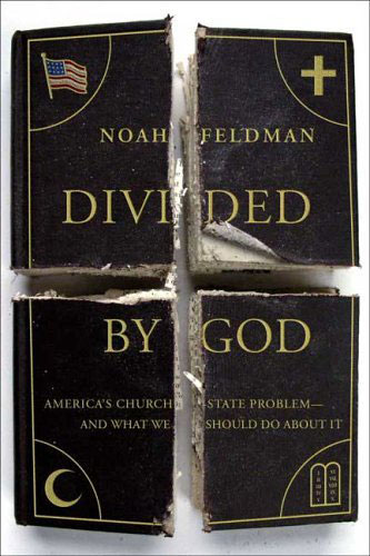
Has religion taken a chain saw to the vision of America?

In reading about NYT law professor Noah Feldman’s new book "Divided by God: America’s Church-State Problem — and What We Should Do About It," I’m not that sure how well the cover represents the contents.  Still, I couldn’t be more interested in the cover.

I’m interested in how you would pull apart (or, perhaps, put back together) this illustration. 

If Feldman is defining a split between American secular and religious interests, how representative are these slices?  Also, is he assuming that the "more fundamentalist" interests of Jews, Christians and Muslims are somehow coequal in opposition to the interests of the state?  (Wouldn’t the image be more accurate if two or maybe three sections sported crosses while the other symbols were grouped together on two different sections, or one quarter section?) 

Given that the book has the look of a bible, are the different religious factions tearing apart the spiritual fabric of our society — or somehow attempting to form separate but equal manifestations of the state? 

How come the "Christian section" is turned up (revealed? exposed?) in the lower left corner?  With the little fragment coming loose, is the "Jewish segment" reaching out to the Muslim one?  Is it simply by chance that the Federal and Christian portions are "on top?"  (What other dynamics can be found in the way the sections are arranged?) 

I guess I understand the Jews being signified by the ten commandments, but when symbolizing Islam, isn’t the crescent supposed to be accompanied with a star? 

If you consider that the illustration depicts a blank white background beneath the book’s cover, doesn’t the image subtlety discredit the idea that these different interests can be reconciled?  Does the fact the subtitle is cut in half also undermine Feldman’s proposed solution?

Because many of you like to know more about the content behind the images I present, I offer a brief summary  after the fold.  (Or, you can read the long excerpt from the NYT Magazine published July 3rd, or these reviews at Salon or the NYT.)

As I understand it, Feldman believes that the line between church and
state is so legally muddled that neither the secularist nor the
evangelicals are happy. Supposedly, the evangelicals seek harmony
through the common embrace of traditional values while the secularists
see unity as an expression of citizenship, with faith remaining a
private matter. Feldman proposes a compromise. He suggests that the
secularists allow the evangelicals open (or at least, equal
opportunity) expression of religious gestures and symbols (prayer in
the classroom; public and private display of Christian symbols and
rituals) in exchange for the removal of public funding or underwriting
of Christian institutions and initiatives (school vouchers, faith-based
charities). Feldman seems to win praise for elaborating the history of
the separation of church and state. His solution, though, earns
criticism as being overly naive.

Certainly, my sense of the evangelical position is one of "winner take all."

  • eva

    In the Christian section, not only one fragment appears to be “coming loose,” but the whole section looks old, frayed and molding. Not surprising that this section also is on the right, ostensibly that priviliged position vis a vis God’s hand. The cover refers to the American pledge of allegiance — “one nation, under God, indivisible”? The central image is that immaterial crucifix floating in the fissure, reminding us of the abyss we are all staring into, religion or no. To suppose these parts were ever united seems an infantile thought.

  • Quentin

    Maybe this time it is correct to judge a book by its cover. It’s about necromancy, freemasonry, sorcery, black magic. The simple linear design reminds me of eighteenth-century drawings of Egyptian hieroglyphs. Spooky images: the wavy, lapel-button flag takes us deep into the realm of the right-wing theocracy; curiously, the cross is the Greek type rather than the western Christian type, which has the transverse bar nearer the top; the crescent moon could use a punctuating star; and, maybe the daffiest of them all, the childish ‘tablets’, hinged, I suppose, with rounded tops, which come straight out of Cecile B. De Mille’s Ten Commandments starring the extreme right-wing icon Charlton Heston as Moses, and which are now beinig replicated on the lawns of U.S. state houses (but inexplicably not in courtrooms): they’re straight out of a biblical theme park.

  • http://tlacolotl.blogspot.com/ Tlacolotl

    Well crap yeah I see “other dynamics” in the positionings of the symbols! For one, notice how the LEFT side has Muslims and secularists (?), the RIGHT is where good Christians and Jews belong.
    What I’m curious about is why the US flag is not a gold-embossed symbol like the others, but is instead one of those shiny lapel buttons worn by showy, overzealous patriots of all stripes in this country. Despite my inclinations, I’m willing to guess that this was merely an aesthetic choice by the artist, who was obviously going for just a teeny bit of “cute” in this image (the visual pun of the portion of the title reading “divided” is, in fact, divided . . . har har!). Certainly it is possible the artist and/or author felt that the “cartoonish” version of the US flag (as opposed to one as purely iconic as the other three symbols) held a good amount of ironic cheesyness — “let’s use one of those dumb lapel pins” — but who knows?
    What about the lack of a Star of David, a more appropriatee Jewish symbol in this context. Flag, cross, cresent (w/o it’s accompanying star?!), and . . . the Ten Commandments. At first glance I didn’t even realize that it was supposed to represent Judaism until I saw the cresent next, then it all clicked. But a Star of David is very obvious in its meaning, just as a cresent with a star, as opposed to a plain cresent, jumps out and says “Islam” to me, instead of my initial response of “what’s up with the moon in the corner?”
    My background is in comics, so I think I tend to take icons too literally sometimes (“lessee . . . two stone tablets with writing? Well, what’s the writing say ? . . . oh, must be the Ten Commandments, okay . . . hmm . . . wait, I get it, “Judaism”!), but I’m also curious about the arrangement of these icons in terms of how they’re “read” — not just left/right, up/down (as opposed to clockwise), but instead of “text; icon, icon, icon, icon”, read “icon/text”, then repeat in standard comic-book left/right, up/down manner:
    1. Flag; “NOAH” (is the USA Noah’s Ark?), “DIVI” (Divi-ne?)
    2. Cross; “FELDMAN” (nothing here I can see), “DED” (dead?)
    3. Cresent; “BY”, “AMERICA’S CHURCH AND WHAT WE” (following the “panel” with the cross, and the word DEAD [followed by] BY AMERICA’S CHURCH”, and WHAT WE . . . what? What do “we” do, and what does it have to do with dead Muslims?)
    4. Ten Commandments; “GOD”, “STATE PROBLEM — SHOULD DO ABOUT IT” (okay this one is scary; I’m starting to hear the stuttered ramblings of nationalist Christian genocidiares here — liberals and Muslims better watch out!)
    And what’s up with the “short” cross? It should be about 20% taller than it is in this image, shouldn’t it? More playfulness, or perhaps there’s some intended (or otherwise) “short bus” intonations? Look at the dumb Christians, riding on the short bus . . .
    Well I for one feel like this is reading too much into it, but who knows what subconscious (or otherwise) messages made its way into the artist and/or author’s heads? At this point I haven’t the foggiest notion of what bias the author has, but I don’t think it matters. It’s suprising how much makes it into an image that is beyond the control of the image’s creator, even with drawn images. Visual artists are as mired in the swamp of language as writers are, it’s just a language that by it’s nature cannot be easily described with words. But this site certainly has an apt way of at least trying to pick apart this gooey psychic stuff . . .

  • Oh wait

    It just hit me: Feldman is a character from a Dan Clowes comic. This cover wasn’t designed by Chris Ware, was it? Those Ten Commandments look suspiciously like one of his drawings, and the subtle sarcasm is a match . . .

  • Tlacolotl

    Oops, I put a “subject” in my name that time . . . anyway, Feldman, I forgot to explain, is the character in Ghost World who rode around in an electric wheelchair he did not need to use. In his original appearance he was notorious for using his WiFi at the espresso shop to find the answer to the shop’s trivia-question-of-the-day, and get his free drink every morning, much to our heroines’ amusement (naturally). What this has to do with the short-bus cross people, I don’t know for sure, but I’m developing some suspicions . . .

  • http://www.someoldguy.typepad.com/ PJ

    You ask if religion has taken a chainsaw to the vision of America. My first reaction was purely on the technical side: a chainsaw kerf is, at minimum, three-eights of an inch, unless you have teeny one-hand electric surgical number. But that’s a jagged-edged cut, I mean really coarse. I’d be ashamed to have the ends of my firewood looking that ragged (ashamed, that is, for what it would say about my skills with the saw).
    The image was put together, not by cutting one book into quarters, but by cutting four books (minimum, and that’s assuming no screw-ups). Those separate chunks won’t even fit together — the edges don’t match.
    For our modern technological age, it would have been more appropriate to cut a single book into quarters, using a good band saw. Neat cut lines, relatively smooth edges, and the kerf would have been small enough that the lettering would still be intact.
    Third-rate premise, inept execution.
    Most of the preceding comments about the symbols are right on.

  • http://www.globalsecurity.org/military/ops/iraq_casualties.htm ms kubelik

    Divided by God?
    Um, no.
    How about:
    Divided by Fundamentalism.
    I do appreciate the tension between the flag symbol and that of the other three corner symbols: these 4 are separate but equal within the signifying field, which suggests the provocative tension that is the book’s focus.
    But I agree w/the comments re the strange selection of symbols for the religions, as well as the left/right & top/bottom divisions.
    Moverover, the way the book is cut apart creates a cross from the white space.
    This makes the cross a subtle, but dominant, symbol in my reading of the image.

  • CK

    You could also look at where the binding is. The US State will hold itself together as will Islam. In their current position Christianity and Judaism won’t be able to hold together on their own. For these two to not fall apart they need to connect with, respectively the State and Islam. At one earlier point in time it would seem plausible that the connection between Christianity and the State was a negotiated peace. At that same time the Jewish/Muslim connection was a balance through force. These halves may soon be turning upside down as Israel and Palestine are now looking to negotiate a peace while Fundamentalist Christianity is taking a more aggressive approach to strengthen its grasp on The US State. This may not be the way history plays out. I leave the photo curious what each section with loose pages does, and to what length they go, to hold together.

  • http://www.churchofthefrontporch.blogspot.com via

    Isn’t the crescent with the star a symbol of Shiia Islam and without the star Sunni?

  • cj

    You know, I don’t see the ten commandments repesenting anything but the recent public display controversy over the ten commandments. That’s a christian religous right thing, not a Jewish thing. The right versus the left stuff is christian fundamentalism versus multicultural acceptance–I find it interesting that the American flag and the cresent are both on the left, while the cross and the commandments are on the right. I see the real issues occuring in the diagonals–flag versus commandments and christian versus muslim. Can a secular America coexist with a fundamentalist christian politic any more than the apparently antogonistic christian/muslim global rift? This photo implies (to me at least) that the split/tension is of a christian making (vertical and horizontal cuts in the book’s cover and reinforced by the curled edge in the christian quardrant). Maybe I am just too willing to concede that we (Americans) are the source of our own problems……is there an online course you can take in scapegoating…??!!