Notes
Make Up Sex: The Ongoing Saga of the NYTimes Political Photo Coverage
Sometime in the summer, I started a blog category called “Leading Photos.” Inspired by the unconventional cover photos in the NYTimes, I would occasionally post the most interesting shots while offering various wry suggestions as to their subtext. (Example 1, Example 2)
If you’ve been following the BAG, you know I’ve been concerned about how the presidential race has seemed to throw the Times photo coverage completely out of wack. Not only have they lost what had been a consistently unconventional and subtlely evocative rhythm in their (political) photo coverage, I believe many shots of Kerry had begun reflecting stereotypes of the the candidate propagated by the Bush campaign.
Over the weekend, I blogged about the Times Public Editor’s defensive comments (in Sunday’s “Week In Review”) about bias in their photo coverage. With the new week, my hope was that the coverage would not just rebalance, but return to the creative and interpretative style to which I was originally drawn.
Certainly, the Times’ coverage of the third debate would form an interesting test to see what developed (pardon the pun).
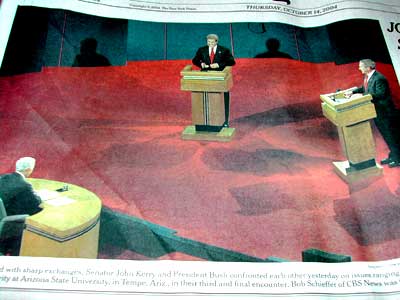
Scooping the Times off the front lawn this morning, I would never have anticipated what slid out of that blue plastic. There, at the top of the front page, was a huge, four column wide image of the debate stage. At the bottom left was Bob Schieffer. At the extreme middle right was George Bush. And there, framed in the slightly upper middle was John Kerry, buttoning his coat and smiling like the cheshire cat. My first thought was: “My God, the New York Times just called the election three weeks early!” My immediate next thought was: My God, these guys are now so freaked out about a possible Bush bias they’ve done a 180º the other way!”
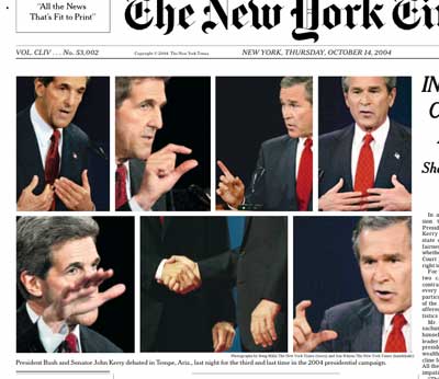
That wasn’t even the best of it though. After pulling in to work and pulling out the portable, I signed on to the Times website to find that the photo on my West Coast edition had disappeared! It was so jarring, I had to pull out the paper version and check it again.
Examining the new treatment was both interesting and a little disheartening. Taking up those four columns was now what could only be called a “painfully balanced” photo montage. On the top row were two photos of Kerry, meticulously juxtaposed with two photos of Bush. The bottom row had a Kerry on the left, a Bush on the right and a “handshake” in between.
I’m sure, if the Times people are reading this, they are spitting that I could never be satisfied. ‘Give ’em the benefit of the doubt on the Bush bias, and he complains about favoring Kerry.’ ‘Give ’em a scrupulously balanced montage, and he complains that the Times is too self-conscious.’ Well, sorry to be unforgiving, but self-consciousness was the theme of the day.
By the way, in spite of the fuss, I don’t think I’m asking that much. I don’t want the subtle Kerry diminishment. I don’t want him getting free passes, either. (That’s like the journalist equivalent of make-up sex.) I just want the Times with the old mojo back.
Follow us on Instagram (@readingthepictures) and Twitter (@readingthepix), and subscribe to our newsletter.
Topic
A curated collection of pieces related to our most-popular subject matter.
Reactions
Comments Powered by Disqus