Notes
Defining the NYTimes’ Photo Bias: (Or, Kerry Still Getting Short End of the Pic)
Because I’ve been on something of my own campaign regarding (what I see as) bias in the NYTimes campaign photo coverage, I thought it might help to be more specific about it. I was thinking, for example, how I would lay it out to the Times editors.
So here’s some criteria:
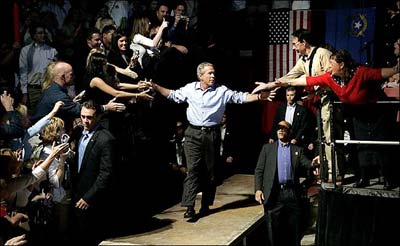
1. In juxtaposing photos of Kerry and Bush on either the same web or newspaper page, photos of Bush often show him either physically engaged with, or interacting with an admiring crowd, while photos of Kerry often depict him alone (or in the presence of people delegated to be there) where the presence of the crowd or audience is only (eerily) implied. (In the print edition, by the way, the Bush photo is usually run above the Kerry photo — as it is today.)
In photo’s of Kerry (whether juxtaposed or not), this is what often occurs:
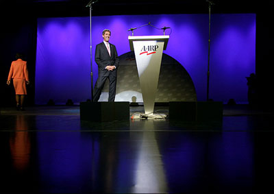
2. There is a photo of Kerry in which the camera angle creates an effect that reduces him in stature. This typically occurs by showing Kerry from a distance. This effect might accentuate the size of objects closer to the camera, making Kerry look no bigger than a podium, or even an apple.
It can occur by showing him in the foreground of a much large object, such as a jet, or juxtaposed against a vast benign background, such as an almost endless sky. It can also occur with a shot from above, so Kerry looks reduced in the context of an event, or the event as a whole becomes diminished. It can also be the case where Kerry is physically distorted in some way, such as having a part of his body cut off.
So, what’s my issue with today’s Bush/Kerry coverage? (Web story here. Print edition: page A23.)

In the Bush shot, the President emerges out of the shadows in dramatic light. He is balanced symmetrically in the center of the image, responding to an adoring crowd. The shot both depicts and signifies someone who reaches out, and makes real contact with people on both sides of the aisle.

In the Kerry photo, the Senator is once again shown in isolation in spite of being in a room full of people. Because of the long shot — at the deep back of a stage, with his feet cut off — Kerry is "miniaturized" so he’s no taller than the podium. In contrast to the Bush shot, where the President basks in the light, the spotlight here emphasizes the empty podium.
The depiction of the (only) other person in the shot is also evocative. She has turned her back to the candidate, and is walking away. Of course, he’s going to give a speech. But, you still have the symbolism of someone taking an exit. Again, the image is characterized by a disproportianate amount of dead space.
Basically, what you have is an unanchored Kerry, situated outside the primary spotlight, captured in a diminutive scale, in a shadowy setting that dissolves into a darkened void. (In the print edition, where both shots are black-and-white, these distinctions are even starker.)
Then again, it could all just be my imagination….
(For previous posts on the subject, see the category "Leading Photos.")


Reactions
Comments Powered by Disqus