Notes
Growing Those Bushes
For some reason, I’ve always been crazy about the politically creative use of charts, maps and graphs–especially if there is some form of parody involved. Because cartoonists, artists and illustrators employ this form sporadically rather than primarily, I hold the highest regard for the weblog UggaBugga. Having been around since mid-2002, this site not only employs charting and graphing as a “mainlight,” it does so with style and with a distinct signature.
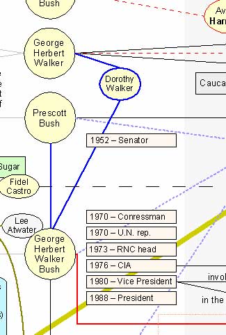
The image above is a section of a wonderfully detailed map they created entitled: Diagramming Kevin Phillips’ book on the Bush dynasty. As they continue generating images that are incisive as they are clever, I hope to featuring them.
Follow us on Instagram (@readingthepictures) and Twitter (@readingthepix), and subscribe to our newsletter.


Reactions
Comments Powered by Disqus